Design discussions 01
Pickin' Panki is very simple. A what you see is what you get kind of deal. So I have decided that instead of expanding on features and mechanics I will talk more in detail on the design and philosophy behind the development process. If you're interested in the thought process that goes into developing a game during its early stages I think you'll enjoy my devlogs.

Planning started back in 2015 when I began making early concept art and rough sketches of the mechanics. While I knew I wanted to make an RPG game, I wasn't sure what it would play like. The project could easily grow out of control, so I had to trim things down and keep the essentials. I decided to focus on something I think is downplayed in modern RPGs; Exploration. Spot something suspicious, go explore off the beaten path and find a secret cave or treasure. I figured I could make a game that would bring simple exploration to the forefront. Because of this, other aspects had to be streamlined. If you take the time to explore, you will be rewarded. That is the basic premise.
With that out of the way, what have I spent most of the time working on?
Map design, game flow, flavor text, graphics and secrets.
Nintendo games have been a big source of inspiration, and I have tried to adopt a similar approach to the design. One of the concepts I've used is the way Zelda-games reward curious players with rupees and heart pieces. In those games you need a certain number of pieces/spirit orbs in order to grow stronger. But finding one heart piece when you're still missing another three is not as satisfying as completing a full heart container.
So I decided to make every "heart piece" you find in Pickin' Panki add to your total energy. The value depends of the type of food. A turnip only adds one, while a jar of sweet jam packs a whopping 20 points! One single piece of food may not make a noticeable difference, but it all adds up over time. If you want to tackle new areas and tougher monsters you'll need all the food you can find. Battles are usually a numbers game; The more energy you have, the easier the encounter. But more on battles next time...
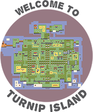
Another idea I borrowed from Zelda was the static camera from the first game. Each screen in Pickin' Panki is small and self-contained. Monsters, food and pathways are easy to identify. Keep walking off the edge of the screen and the camera pans ahead to the next. Lined up side-by-side these screens create a large interconnected area that often loops back in on itself using shortcuts and hidden paths. Segmenting the game this way gave some structure to work with and kept designing bigger areas from feeling overwhelming. Screens are manageable bite-sized challenges with their own sense of purpose. I could design them one by one as long as I left some room for shortcuts connecting them to one other. It also makes the game feel more dense. Another convenience I realized using a static camera, was that no secrets will accidentally scroll into view as the player moves around the map. It gives me control over what the player is allowed to see and when.
Hope you've enjoyed this first installment.
Until next time, take care!
Get Pickin' Panki
Pickin' Panki
Eat, fight and explore in this back-to-basics adventure!
| Status | In development |
| Author | Harkenman |
| Genre | Role Playing |
| Tags | Exploration, Pixel Art, Retro, Top Down Adventure, Turn-Based Combat |
More posts
- 1.0 IS HEREJul 01, 2020
- Sign up for playtesting!Jan 16, 2020
- Design discussions 02 + OST RELEASE!!Aug 24, 2019
- Island sneak peek!Nov 30, 2018


Leave a comment
Log in with itch.io to leave a comment.